5 reports every Membership Director needs (but can't currently get)
Most membership organizations are sitting on more data than they've ever had, and still can't answer the questions that matter most. Not because the data isn't there, but because the systems weren't built to connect it.
The problem isn't resources, and it's rarely skills either. It's that most membership management platforms were built to process transactions, not to surface insight. The data exists. The reports don't.
Here are five reports that every Membership Director needs to do their job well, and that most are still cobbling together manually, or going without entirely.
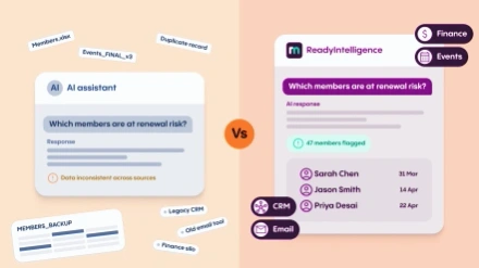
1. The at-risk member report
Every experienced Membership Director has a gut instinct about which members are about to leave. The ones who haven't attended anything in over a year, stopped engaging with emails months ago, or quietly downgraded at their last renewal. Each signal on its own is easy to miss or explain away. When you see them together, the picture is much harder to ignore.
The problem is that in most organizations, these signals live in different places. Email engagement sits in the email tool. Event attendance is in the events system. Subscription history is in the CRM, if it's kept properly at all. Pulling these threads together into a single, ranked list of at-risk members requires either a sophisticated integration project or a lot of manual work.
What Membership Directors actually need is a real-time view of engagement across every touchpoint, scored and prioritized so the team knows exactly who needs attention this week, not last quarter's data cleaned up for a board meeting.
The business case is straightforward: retaining an existing member almost always costs less than recruiting a new one, and if your reporting can't tell you who's about to leave before they've decided to go, you're always playing catch-up.
2. The cohort revenue forecast
Budget cycles and reporting cycles rarely line up, and the gap between them is where most financial surprises happen.
A cohort revenue forecast answers a specific and important question: of the members we have today, how much subscription income can we realistically expect over the next 12 months, broken down by membership grade, join date, and renewal pattern? It's not the same as last year's income plus an optimistic percentage. It's a forward-looking view built on actual renewal behavior.
Most organizations can't produce this report because the data required sits across their membership platform and their finance system, and the two rarely talk to each other in a meaningful way. Even when integrations exist, the renewal completion timeline, the gap analysis, and the grade-switching history needed to build an accurate forecast often aren't being tracked in a form that makes calculation straightforward.
The result is that budget conversations happen with incomplete information, and the first sign that the forecast was wrong is when it already is.
3. The member journey conversion report
When someone decides to join your organization, they typically go through an online journey: they land on your website, explore the membership pages, and either complete the join process or they don't. Most associations have no visibility into where in that journey people are dropping off, and no way to connect anonymous website behavior to known contacts in the CRM.
This matters for two reasons. First, if your online join process is losing 60% of people at the payment step, that's a fixable problem. But you can only fix it if you know it's happening. Second, if someone starts the join process and abandons it, the ability to follow up, whether through retargeting or a direct communication, can recover a meaningful proportion of those incomplete conversions.
The same logic applies to renewals. If members are clicking the renewal reminder email and then not completing the payment, where are they stopping? Is it the payment page? The grade selection step? Understanding the drop-off points in your conversion funnels is one of the highest-value pieces of insight a Membership Director can have, and one of the hardest to get from most systems.
4. The engagement score report
Renewal rate is a lagging indicator. By the time a member doesn't renew, the decision was made weeks or months ago. What Membership Directors need alongside their renewal data is a leading indicator: a live measure of how engaged each member actually is, right now.
An engagement score does this by combining activity across multiple dimensions. How recently did a member log into the member portal? Have they attended events? Do they open emails? Have they accessed resources, completed a CPD record, or participated in a community? The specific inputs will vary by organization, but the principle is consistent: combine behavioral signals into a single score that reflects the health of each member relationship.
The challenge is that building this report manually is genuinely difficult. It requires clean data from across every member touchpoint, a consistent scoring methodology, and a way of surfacing the results that makes them actionable rather than academic. Most organizations either don't attempt it or produce a version that's too static and too slow to be useful operationally.
Done well, an engagement score report transforms how a membership team prioritizes its time. Instead of treating all members the same, or relying on instinct, you have a data-driven basis for deciding who gets a personal call, who goes into an automated re-engagement sequence, and who is genuinely fine and doesn't need any intervention.
5. The consolidated performance dashboard
Each of the four reports above describes a specific data problem. This one describes a structural problem that underlies all of them.
Most Membership Directors have to log into multiple systems to get a complete picture of their organization's performance. The membership platform shows subscriptions and renewals. The email tool shows campaign performance. The event system shows attendance. The finance system shows income. None of these views connects to the others, and the effort required to consolidate them into a single, coherent view of organizational performance is substantial.
The report that most Membership Directors can't get is actually the most fundamental one: a single dashboard that shows, in real time, how membership is growing, how members are engaging, how events are performing, how campaigns are landing, and whether income is tracking to plan. Not as separate tabs. Not as separate exports. As a single, integrated view that reflects the whole picture.
This is the report that enables genuinely confident decisions, the difference between "I think renewals are up, based on last month's data" and having a single, integrated view that shows exactly where you are, what's working, and what needs attention.
What good reporting actually looks like
The common thread across all five of these reports is integration. The data required to produce them exists in almost every membership organization. The problem is that it lives in silos, and moving it between those silos manually is expensive, slow, and error-prone.
The shift towards unified membership platforms, where the CRM, website, events, email, and finance data all sit in one place, is what makes these reports possible without a team of data analysts or a custom development project. When everything is connected, the reporting becomes a configuration problem rather than an engineering problem.
For associations that have historically accepted fragmented reporting as the cost of operating with lean teams and limited budgets, that shift is significant. These five reports aren't aspirational. They're achievable. The question is whether your current systems are set up to deliver them.
If you'd like to see what connected membership reporting looks like in practice, explore ReadyMembership's analytics and reporting capabilities.