What mobile-first design actually means (and why responsive isn't the same thing)
Ask most membership organizations whether their website works on mobile and the answer will be yes. It’s responsive, it scales down, it technically fits the screen. But ask a designer whether it was designed for mobile — whether mobile was the starting point rather than an afterthought — and you’ll often get a more complicated answer.
Responsive and mobile-first get used interchangeably. They’re not the same thing, and the difference shows up in ways that are easy to miss when you’re reviewing a design on a large monitor in a meeting room.
What mobile-first actually means
Mobile-first is a design and development approach that starts from the smallest screen and works outward. Rather than designing a full desktop layout and then adapting it down, you begin with the constraints of mobile — limited width, vertical scrolling, thumb navigation — and use those constraints to force clarity.
When you work this way, you have to make decisions you can defer on a wider canvas. What is the most important thing on this page? What can be removed without losing anything the user actually needs? How does navigation behave when there’s no room for a horizontal menu? These aren’t just mobile questions — they’re fundamental questions about what the site is trying to do. The discipline tends to produce cleaner, more intentional design at every screen size, because the thinking has already been done where there’s least room for ambiguity.
I came across an analogy recently that stuck with me: the difference between designing a kitchen around the dimensions of a floor plan and designing it around how someone actually cooks. Responsive design, at its worst, fits content to a space — things technically work, but they were designed for a different context. Mobile-first fits content to the user. It’s a subtle distinction but it has real consequences for how a site actually feels to use.
Why mobile still tends to get treated as an afterthought
Despite mobile accounting for roughly half of all web browsing — and more in many sectors — it still tends to come last in design processes. Desktop visuals get the attention in client meetings. The “wow factor” comes from big impact layouts on a wide screen. Mobile is the question someone asks at the end: does it work on mobile?
I understand why this happens. For many membership organizations, their analytics show that members completing high-value interactions — joining, renewing, booking events — do so on desktop. If someone is about to spend money or work through a multi-step form, they may well switch to a larger screen to do it. But this pattern can obscure what’s happening earlier in the journey. Members and prospective members are browsing and forming impressions on their phones long before they get to a desktop. If that initial experience is difficult or poorly considered, some of them won’t get that far.
There’s also a tendency to treat whatever the SEO data shows as a reason not to prioritize mobile. If the majority of converting traffic comes from desktop, mobile gets deprioritized. But that logic can become self-reinforcing — a poor mobile experience suppresses mobile engagement, which the data then confirms.
Where things tend to fall apart
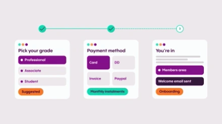
Complex forms and multi-step processes are where the lack of mobile-first thinking causes the most visible problems. Joining journeys, renewal flows, event registration — these were often designed for desktop and then scaled down. The result tends to be input fields that are awkward to use on a touchscreen, progress indicators that don’t translate well to a narrow screen, and calls to action that are easy to miss. Government digital services have done a lot of thoughtful work on making complex forms genuinely usable on mobile, and the contrast with many membership websites is noticeable.
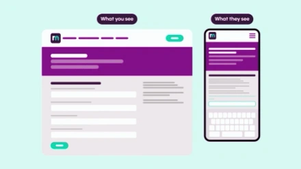
Imagery is another area worth more attention than it usually gets. A banner that looks striking on a widescreen monitor will reformat differently on a phone — cropping to a different focal point, losing context, sometimes rendering in a way that clearly wasn’t intended. This matters most when the image is doing real work: setting a tone, supporting a message, guiding the eye toward an action. It’s easy to overlook when you’re working primarily on a large screen. I’ve seen it cause problems on sites we’ve built ourselves — you design and review at desktop resolution, and it’s only when you pick up a phone that you see the image isn’t behaving as expected.
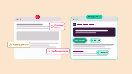
One thing that’s worth flagging here: placing text inside images is particularly problematic. Screen readers don’t pick it up, and when the image reformats onto smaller devices, that text can lose legibility entirely or get cut off. It’s a habit worth breaking regardless of whether mobile is the primary concern.
A quick sense-check for your own site
If you want a rough read on how your site performs on mobile without commissioning a formal audit, a few things are worth looking at directly on a phone:
- Typography. Does text remain readable without pinching to zoom? Are headings proportionate, or do they dominate the screen and push the actual content down?
- Navigation. How many taps does it take to reach your key pages? Is the collapsed menu predictable, and are the most important journeys — joining, logging in, finding an event — easy to locate within it?
- Images. Check banner and hero sections. Is the focal point still visible, or has it been cropped in a way that wasn’t intended?
- Forms. Try completing a join form or event registration on your phone. Pay attention to field sizes, whether the right keyboard type appears for each input, and whether the submit button is easy to find and tap.
- Load speed. Time how long key pages take to appear on a mobile connection. More than a few seconds and you’re losing visitors before the page is fully rendered.
None of this requires specialist tools — just a phone and the willingness to use your own site the way a large proportion of your members do.
How ReadyMembership approaches this
ReadyMembership is built on a mobile-first design system, meaning the responsive behavior of templates and components has been considered from the ground up. The modular structure — where individual content blocks each have defined mobile behavior — means the building blocks of a page work at every screen size independently, rather than relying on a global scaling rule to handle everything.
The practical implication for organizations is that the baseline mobile experience is solid. But a mobile-first platform doesn’t automatically produce a mobile-first experience — the thinking about content hierarchy, imagery, and navigation still has to happen. It just means the foundation makes it significantly easier to get right.
Mobile-first design for membership websites isn’t about chasing a statistic or satisfying a technical requirement. It’s about recognizing that the way your members access your site has changed, and designing with that reality in mind from the start rather than accommodating it at the end. The organizations that get this right tend to see it reflected in the things that matter: members who complete journeys they previously abandoned, prospects who form a better first impression, and teams who spend less time fielding support queries about things that should just work.