5 signs your membership website was designed for desktop first
Most membership websites are responsive. They scale down, they technically fit a phone screen, and if you test them quickly they look fine. But there’s a difference between a site that accommodates mobile and one that was genuinely designed with mobile in mind from the start — and that difference tends to show up in the details, often in the moments that matter most to your members.
Here are five signs that your site was built desktop-first, and what they mean for the people using it.
1. Your forms are difficult to complete on a phone
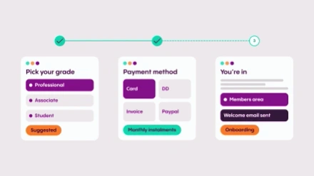
Joining, renewing, registering for an event — these are the highest-value interactions on your site, and they’re often the most painful to complete on a mobile device. Fields that are too small to tap accurately, keyboards that obscure the form as you type, progress indicators that don’t adapt well to a narrow screen, submit buttons that sit just out of reach: these are all symptoms of a form that was designed for a mouse and a full keyboard and then asked to work on a touchscreen.
The frustration this causes is real, but it tends to be invisible to teams who review designs on desktop. If you’ve never tried to complete your own join or renewal form on a phone, it’s worth doing. Government digital services have invested heavily in making complex forms usable on mobile, and the bar they’ve set is a useful reference point for what’s achievable.
2. Your banner images crop in unexpected ways
A hero image that looks carefully composed on a widescreen monitor may tell a very different story on a phone. The focal point shifts, important visual context gets cropped out, and text overlaid on the image — if there is any — can lose legibility entirely when the image reformats to a narrower aspect ratio. This is particularly common on sites where imagery was selected and positioned with only desktop in mind.
It’s easy to overlook because you don’t see it unless you’re actively checking. The fix isn’t complicated — images chosen with mobile cropping in mind, and focal points positioned to survive the transition — but it requires thinking about the mobile experience before the design is signed off, not after. One thing worth avoiding entirely: placing text inside images. Screen readers can’t pick it up, and on smaller screens it frequently becomes unreadable.
3. Your navigation assumes more space than a phone can give
Desktop navigation tends to be horizontal, with room for multiple items sitting side by side. On mobile, that collapses — usually into a burger menu — and how that menu behaves once it’s open is where things often go wrong. Too many items with no clear hierarchy, sub-menus that are difficult to navigate by touch, key journeys buried several taps deep: these are all signs that the navigation was designed for a wide canvas and then compressed rather than rethought.
Good mobile navigation is ruthless about priority. Five or six clearly labeled items, logically ordered, with the most important member journeys — joining, logging in, finding an event — easy to reach within one or two taps. If a member has to work to find what they’re looking for, some of them won’t bother.
4. Your typography doesn’t scale gracefully
Text that looks well-proportioned on a large monitor can behave unexpectedly on a small screen. Headings that span six lines before the first paragraph begins, body text that requires pinching to read comfortably, line lengths that run too long or break too short — these are all signs that type was set for desktop and left to scale on its own. On a well-designed mobile site, typography is treated as a dynamic element: sizes, spacing, and line lengths respond to the screen rather than just shrinking proportionally.
Legibility is the baseline, but good mobile typography goes further than that. Appropriate contrast, sufficient line height, and sensible character counts per line all reduce cognitive load and make reading on a small screen significantly less tiring. It’s one of those things members rarely notice when it’s right, but definitely notice when it isn’t.
5. Your content hierarchy assumes the user can see everything at once
On desktop, a well-designed page can communicate a lot at a glance — headline, supporting message, key actions, and contextual information all visible without scrolling. On mobile, that same page becomes a sequence. Users see one section at a time, scrolling through content in the order it’s presented. If that order was determined by how things looked on a wide canvas rather than what a mobile user actually needs to see first, the experience suffers.
Mobile-first design forces you to be intentional about hierarchy: what is the single most important thing on this page, and is it appearing before the fold? What can be moved lower, or removed entirely, without losing anything the user needs? These are questions that tend to produce better design at every screen size — but they only get asked if mobile is the starting point, not an afterthought.
If several of these sound familiar, the good news is that none of them are unfixable. Some are straightforward design adjustments; others may require a more considered rethink of specific journeys or templates. Either way, the starting point is the same: pick up a phone and use your own site as a member would. What you find will tell you more than any analytics report.