Three top tips to ensure your website creative design delivers more than a pretty face
Are you thinking about undergoing a website transformation or update but not sure where to start? A good creative design is more than just about making things look beautiful, it’s also about making sure that it is providing a beautiful and simplified experience for your members.
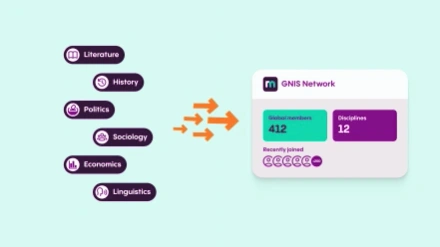
We spoke with Pixl8 and ReadyMembership’s Senior Digital Designer, Andy Orme, on his top three tips of what membership organisations should have ready in order to balance the want for a creative design with the need for a robust, intentional, user-centred website journey.
Read below for his three top tips, and if you are interested in working with our ReadyMembership team for your new website then you can contact us here: https://readymembership.com/contact-us.html

Andy Orme, Senior Digital Designer
1. Keep your members (the end user) in mind at all times
Even the most beautifully designed websites can be rendered useless if the target users can’t navigate their way around it. Before you invest time in writing copy, sourcing images, and finding a partner to do your website build, it’s really important to know what are the key pages or pieces of information you are trying to direct people to are. For many of our clients these tend to be sign up pages, or specific conferences, events, or award shows that are coming up that they want their users to know about. Sometimes it’s all about the resource page, either helping people discover more about their interests, or showcasing the range of quality content that only members have access to. When you move to thinking about page structure it’s also key to question yourself “what do I want the user to do next after this” and is that step clear or does your page leave your users with nowhere to go?
The homepage is obviously the key page to think about as the flagship part of the website, so it feels counter-intuitive to not start with it when planning. I actually recommend the opposite, it’s the homepage that everyone tends to have an opinion on. If you start planning the other pages first you know exactly what your main message is that you need to put on the homepage which is critical for it to not feel generic.
2. Look to websites you like (or don’t like!) for inspiration
It’s always best to think of real-life examples when you’re looking for inspiration about how to plan journeys for your website. Find websites that are similar to what you want to do, or that you think of as best-of-breed, or even ones that are totally different to your but that you enjoy using in your day-to-day life, and note what you do and don’t like about the layout and navigation. Often it’s easy to instinctively know what you think is good or bad, but then you need to try to think critically about why you think that. Equally, it’s important to find examples of what you like as much as what you don’t! You can then turn this to your website to identify exactly what you want to achieve and how you need to apply it to the design navigation.
We recommend this to our clients when they’re right at the beginning of the planning process. We call it the “20 second test” where you very quickly navigate around any sister websites and key competitors for quick fire feedback which can be communicated to us – it can be really effective and is a great way to ensure your designers understand what is in your mind that might not have been communicated in the written brief!
3. Have the key parts of your brand ready
It sounds obvious, but it will slow you down if you don’t have your key brand assets to hand when starting the website project. For any website rebrands, it’s also great to revisit these components as brands find ways of evolving! It’s important to check that what is going on your website is still a true reflection of what is being used elsewhere. At a minimum what I recommend is:
- Your company logo in a vector (.svg) format – this means it’s scalable and so useable for any size or location
- Your brand font or fonts
- Your colour pallet, ideally broken into primary colours, secondary colours, and then tertiary colours or accent colours. If you have the Pantone or Hex codes for this so much the better!
It’s also really important to have an idea of what style of imagery you think works for your brand. Often with our ReadyMembership clients they will have photography they’ve commissioned for their current site or taken at member events, sometimes they also have a visual theme to any stock imagery they select so that all images look aligned.
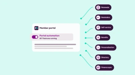
Overall, sometimes website design – like most visual things – can be at risk of subjectivity. But if you ensure to incorporate data and insights into your planning, you can ensure that you end up with something that is both a useful tool that helps your members, as well as something that looks great. With our ReadyMembership product, its modular approach has been built to enable a good UX experience, so you have one fewer thing to worry about when you start your build.